Print design is becoming less of a requirement in the ever evolving digital marketplace. However, I believe it's far from disappearing entirely. I've noticed fine printed materials with beautiful papers and finishes becoming a standout luxury in the business world--making print design quality more important than ever. In an effort to make the world a more beautifully designed place, I've created a list of 3 tips to help you avoid common print design pitfalls, and ultimately create higher quality printed materials.
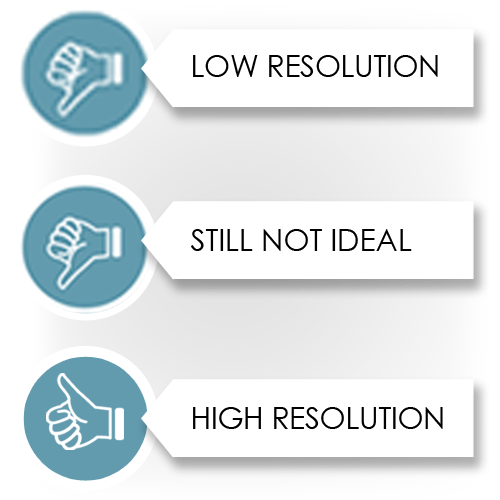
Whether you’re creating a new InDesign, Photoshop, or even Gimp project, it’s important to set up your digital canvas at a high resolution to ensure you get crisp, clean lines in your final prints. If the project resolution is set too low, such as many graphics designed for quick loading time on websites, your printed version will inevitably result in jagged, visible pixel edges, or blurry, soft images.
As a rule of thumb, I like to use 300 dpi (dots/pixels per inch) for print projects. However, if you’re printing large scale signage or exhibit graphics, you can get away with artwork setup at 150 dpi so that your files don’t slow down your computer’s performance and so that your final file is more portable to send to your printer.
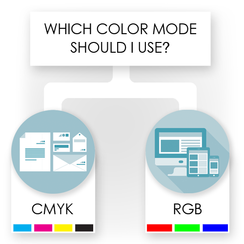
The most important consideration when designing for print is to ensure you’re working in the best color space (also known as color mode). The two color spaces pro designers are all too familiar with are RGB (Red, Green, Blue), used for digital design, and CMYK (Cyan, Magenta, Yellow, Black) used for print design.
Although photography and graphic elements may be originally created in RGB color mode, which is what scanners, digital cameras, and many design tools default to, be sure to convert your digital canvas to CMYK color mode. Doing so will help to avoid color variation surprises when your design comes to life in print--such as oversaturated color or a hue that is noticeably warmer or cooler than it appears onscreen.
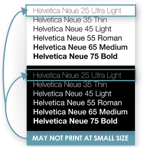
A classy, light weight font style and slim, sophisticated lines can be beautiful elements to use in design. However, you need to watch your weight to ensure your lines are still legible in print. Fine white type or border lines on a dark background can disappear from your print if you’re not careful.
Always request a printed proof when designing with light weight elements. In the digital world, it’s easy to make adjustments to the font or stroke weight if your design loses some of those fine details when scaled differently across different devices. For print, there’s a little more risk associated with getting it right the first time, as it would be much more costly to amend stroke weight after running 5,000 copies of a new printed brochure.
Don't let pre-existing templates cramp your style. Although templates can be great time savers and solid starting points, sometimes fitting your content into a pre-existing template just doesn't work. Think outside the box, research inspiration and competition, and gather feedback from others. Now, go build something beautiful.
When I'm not designing for clients, I love to have creative discussions about purposeful design. I've recently started a YouTube channel, where I hope to inspire, motivate, and collaborate with other creatives and businesses who need help with establishing art direction and creative strategies. Check out a few of my recent videos below!